Steam Just Updated Its Store Pages, and They Finally Fit My Monitor
It only took them a decade, but the store finally looks good on a modern monitor.
I booted up Steam today to buy a game I don't need, and I had to do a double-take. Something was... off. The store page I was looking at wasn't a narrow little column of text and images, lost in a sea of empty gray space.
The store page was... wide.
Yes, it's finally happened. Valve has pushed an update to the Steam store pages, dragging them kicking and screaming into the modern era of widescreen monitors.
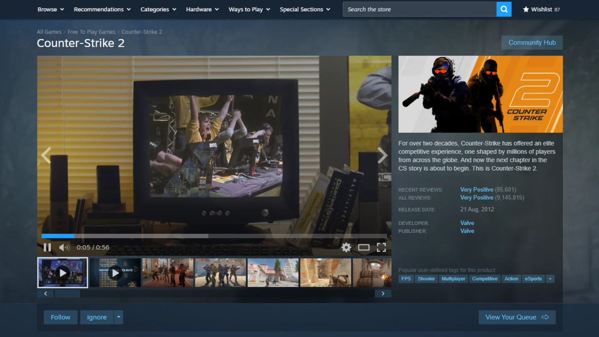
A Widescreen Welcome
The biggest change is the most obvious one: the layout is significantly wider. It's now "more suitable for large screens," which is a polite way of saying it no longer looks ridiculous on any monitor made after 2010. It feels like the store can finally breathe.
What's more, it's fast. Valve has apparently applied whatever magic they used on the new video player to the store pages themselves, and the result is a much snappier browsing experience.
Media Controls That... Make Sense?
They didn't just stop at the layout. The media gallery—you know, the box of screenshots and trailers—has also been fixed.
You can now click simple arrows on the sides of the images to move to the next slide. I know, it's a revolutionary concept.
There's also a new "theater mode" button that pops the media into a larger pane, and a proper full-screen option for images. It's a small change, but it makes browsing screenshots infinitely less annoying.
What This Could Mean (Let's Speculate)
This is a great quality-of-life update on its own. But what's really exciting is what it might signal for the future of the client.
I'm just speculating here, but this doesn't feel like a simple CSS change. The fact that it's "as fast as the new video player" suggests this is a deeper, structural rebuild of one of the oldest, crustiest parts of Steam.
If they're rebuilding the store page, what's next?
Are we finally on the path to a fully unified, modern client? They rebuilt the "Big Picture" mode from the ground up for the Steam Deck. Now the core desktop store is getting a similar treatment. It feels like Valve is finally moving toward a single, responsive UI that works perfectly on a 4K TV, a 1440p monitor, and a 7-inch handheld.
A wider page also gives them more real estate. This could be the first step before they roll out new discovery tools, better curator integration, or more personalized modules that don't have to be crammed into a tiny 800-pixel-wide column.
A Welcome, Overdue Fix
Whatever the long-term plan is, I'll take it. This is one of those updates that isn't flashy, but it's a massive quality-of-life improvement.
It's a sign that Valve is still, in its own slow, methodical way, chipping away at the client's ancient foundations. It's clean, it's fast, and it respects my monitor's resolution. It's about time.
You might also like
72% of Devs Say Steam Is a Monopoly, and I'm Part of the Problem
Steam’s New Personal Calendar: Finally, a Way to Decode Your Wishlist Nightmare
Steam’s Wishlist vs. Reality: Why Some Games Sell Like Hotcakes (And Others Flop)
Steam Says There’s “No Blanket Policy” Against NSFW Early Access, Despite Devs Getting Blocked
It’s That Time Again: Steam Next Fest Is Here to Drown You in a Sea of Free Demos